05 2025
Visual identity for the Mlsáme spolu patisserie
A whole brand from nothing: logo, colour, brand manual and website.
mlsamespolu.cz ↗- Client
- Mlsáme spolu, patisserie and café in Rajhrad, Czechia
- Period
- 2025
- Role
- Visual identity design · website
- Stack
- FigmaLogoColour systemBrand manualWebsite
Context
Mlsáme spolu is a patisserie in Rajhrad. Everything is baked on site daily: pastries, custom cakes, speciality coffee and seasonal ice cream. It also supplies premium desserts to cafés and restaurants.
It was founded by a mother for whom baking is, in her own words, the most beautiful language of love. The whole business rests on three words: joy, family, heart.
It started from a blank page.
Problem
A new business with nothing in place: no logo, no colours, no settled way of talking about itself.
It had to serve two audiences at once: the customer at the counter, and the café buying desserts wholesale.
And it could not end as a one-off set of files. The owner needed to run the brand herself, daily, without a designer on hand.
Decisions
- 01
Hide the meaning inside the letterforms
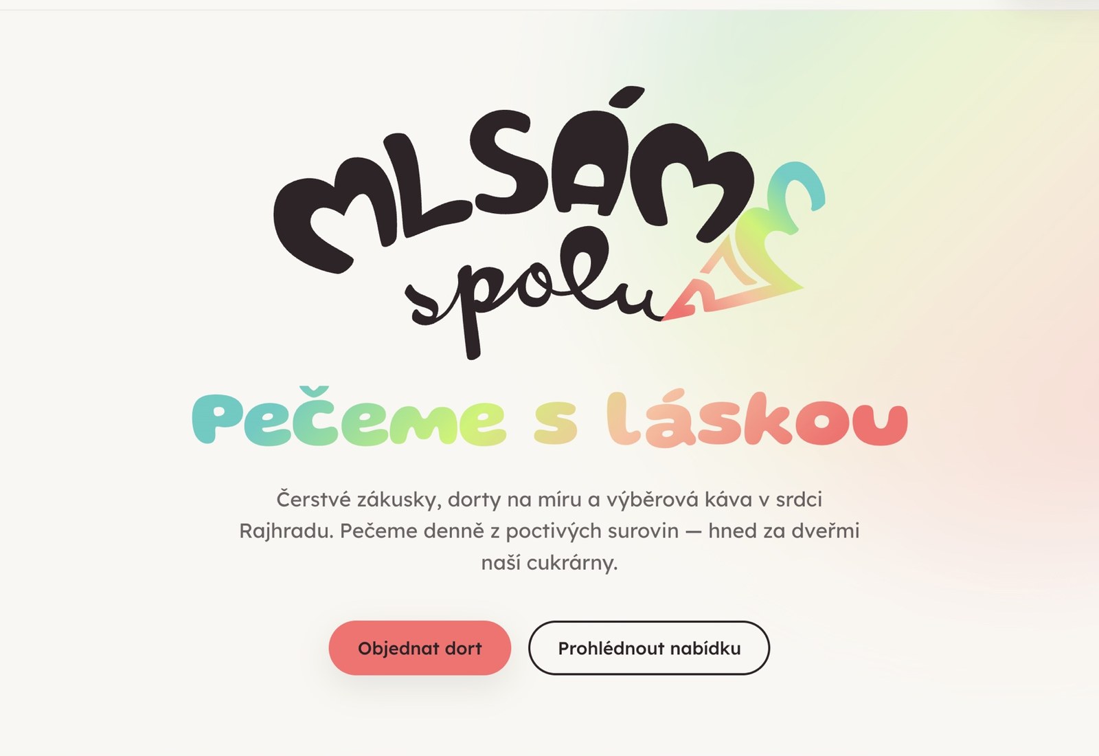
The curves in the “M” are not curves at all; they are hearts. The turquoise tip of a piping bag completes the letter “E”, turning the solitary “Mlsám” (I indulge) into the shared “Mlsáme” (we indulge together). The mark is an invitation rather than a label. “Spolu” is drawn in a single stroke, exactly the way a pastry chef pipes icing onto a cake.
- 02
Colour as the first signal
The palette is built around the feeling of a “sweet home”: warm, appetising, optimistic. It runs from fresh and fruity (turquoise, lime) to warm and baked (apricot, raspberry), so it covers summer ice cream and a winter cake equally well.
- 03
Write rules, not just draw a logo
Clear space is defined as 1× the height of the “M” around the entire mark. Minimum sizes are set by what has to stay legible, the “spolu” line and the “E” detail: 30 mm in print, 120 px on screen; the icon alone 10 mm and 40 px. The gradient runs at a fixed 135°, turquoise top-left to raspberry bottom-right. The logo is never mirrored.
- 04
A brand manual, so the brand outlives me
The most important decision of the whole commission. The manual is written for someone who is not a designer, which is why every colour carries hex, CMYK and RGB, so it works at the printer as well as on the web. Without it the brand would have started drifting the day I handed it over.
- 05
A catalogue for the wholesale side
To make the brand work towards cafés and restaurants as well, I produced a product catalogue: same identity, different audience, different job from the shop window.
- 06
The website last
Identity first, website second. The other order would have meant designing pages before anyone knew what the brand looked like.
My role
- The complete visual identity from scratch: the logo and its concept, colour system, typography, usage rules.
- The brand manual, including clear space, minimum sizes and colour specifications for both print and screen.
- A product catalogue for wholesale customers.
- Design and build of the mlsamespolu.cz website.
- I was the only designer on the commission, from the first sketchbook page to handover.
Visuals
-
Logo concept: hearts in the “M”, a piping bag forming the “E”
-
Logo rules: clear space, minimum size, gradient
-
Colour palette with hex, CMYK and RGB
-
Product catalogue for cafés and restaurants
-
The mlsamespolu.cz website
Result
- A brand the owner runs herself, consistently: in the shop, on packaging, in the catalogue and online.
- A logo that survives being explained. When someone asks why it looks the way it does, there is an answer. And that is the difference between a brand and a picture.
- The clearest evidence that “an eye for detail” is not just a line on my CV. This is the whole other half of the craft, not frontend assistance.